Picking paint feels easy until swatches hit the wall and everything shifts with lighting, flooring, and furniture. A checklist-style approach makes color decisions less emotional and more repeatable—so the final choice feels intentional, not rushed. If you’re using AI room visualization, the same structure helps you feed the tool better inputs and compare options more honestly before you commit to gallons.
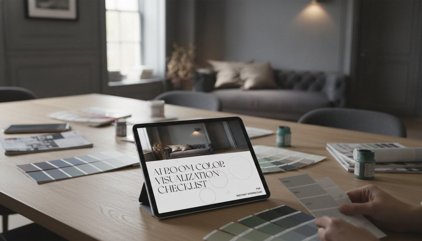
If you want a ready-to-use version you can reuse room by room, the AI Room Color Visualization Checklist (Instant Download) keeps everything in one place—photos, notes, and final codes.
Great color choices start with context. Before browsing paint names, take five minutes to define what the room needs and what it must work with.
| Detail | What to record | Why it matters |
|---|---|---|
| Natural light direction | North/South/East/West exposure | Shifts warmth/coolness and saturation |
| Fixed materials | Wood tone, stone veining, metals | Determines undertone compatibility |
| Existing neutrals | White trim, beige carpet, gray sofa | Prevents clashing “almost matches” |
| Lighting type | Bulb temperature and fixture style | Controls how paint reads at night |
| Adjacent spaces | Hallways, open concept areas | Avoids abrupt transitions |
AI previews are excellent for narrowing direction (warm vs. cool, light vs. midtone, muted vs. saturated). They’re less reliable for the exact “final” color because screens, cameras, and lighting all interpret color differently—a concept rooted in how color is measured and perceived (see the CIE overview of colorimetry).
Lighting plays an outsized role at night—bulb color temperature can make a “perfect” greige look green or a clean white look dingy. For a quick refresher on warm vs. cool lighting and Kelvin ranges, the U.S. Department of Energy guide is a useful reference.
For larger projects (open concept layouts, long hallways, multiple adjacent rooms), a whole-home mindset helps avoid random transitions. The National Institute of Building Sciences interior design resource is a solid starting point for thinking in systems instead of isolated rooms.
If your paint choice is calm and minimal, texture does a lot of the decorating work. A plush solid rug like the Soft Velvet Plush Blue Rug for Living Room & Bedroom can add depth without introducing competing undertones.
Not exactly. Screens, camera settings, and changing daylight can shift how color appears, so AI is best for narrowing direction and comparing options. Confirm your finalists with physical samples on multiple walls and check them from morning through evening.
Testing 3–5 candidates is a practical range. Put them on at least two walls, and include one lighter and one darker option than your “favorite” to calibrate what the room truly needs.
Compare candidates next to a true white and a true gray, then hold them up against fixed elements like flooring and cabinets. Review the results in daylight and again under warm evening lighting before deciding.


Leave a comment