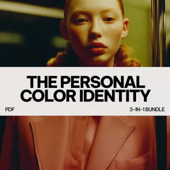
Personal color can feel confusing until it’s broken into repeatable steps: identify what harmonizes with natural coloring, align choices with personality and lifestyle, then use a simple pairing method to build outfits quickly. This bundle combines three digital tools to help refine a signature palette, avoid “almost-right” purchases, and make everyday styling feel more intentional.
A personal color identity blends two realities that matter equally: what visually harmonizes (undertone, contrast, and depth) and what feels authentic (style personality, mood, and context). The goal isn’t a tiny set of rules; it’s a flexible palette that supports confidence across work, casual days, events, and photos.
When the shades near your face cooperate, people often notice “clarity” rather than the color itself—skin looks more even, eyes look brighter, and outfits look finished with less effort. Just as importantly, a structured approach reduces wardrobe clutter: fewer duplicates in the wrong shade, fewer “close but not quite” online purchases, and accessories that actually match more than one look.
The The Personal Color Identity Pack – 3-in-1 Digital Bundle is designed as a practical system you can reuse anytime your life (or hair color) changes.
Because it’s repeatable, it works well for seasonal refreshes, post-declutter rebuilding, capsule wardrobe planning, or simply getting faster at daily dressing.
Start with a small, sturdy foundation: a few neutrals plus 2–4 accent color families that consistently work. These become “easy replacements” over time—when a tee wears out, you already know the exact kind of blue (or cream, or olive) that earns its keep.
Contrast is the difference between light and dark in your overall look (hair, skin, eyes, brows). Low contrast outfits read blended and quiet; high contrast reads crisp and bold. Matching your natural contrast is one of the fastest ways to make outfits look intentional without adding more pieces.
Instead of reinventing the wheel daily, rely on a formula like neutral + neutral + accent or neutral + print + echo color. Your palette supplies the colors; the formula supplies the structure.
| Situation | Easy formula | Color cue to check |
|---|---|---|
| Workday outfit | Neutral base + 1 accent + structured accessory | Keep contrast consistent with your natural contrast |
| Casual weekend | Denim/neutral + softer accent + relaxed shoe | Choose a slightly muted version of your accent |
| Event or date night | Monochrome or near-monochrome + metallic | Use shine/texture to elevate without adding extra colors |
| Travel capsule | 2 neutrals + 2 accents repeated across tops/bottoms | Every item should match at least 3 others |
| Photos and video calls | Solid near face + controlled contrast + minimal pattern | Avoid “almost” shades that dull skin tone |
Watch for warning signs: under-eyes look grayer, redness looks sharper, teeth appear less bright, or the color seems to arrive before you do. Context matters, too: a color can be flattering but wrong for your personality on a day you want to feel understated. For online shopping, remember dye and fabric behavior—lighting and material can shift a shade noticeably. For deeper color fundamentals, resources like the Color Matters: Color and Vision overview and the Adobe Color Wheel can help you visualize relationships like complements and analogs.
If you’re refining your palette and want outfits to look instantly more polished, choose accessories that support your contrast and neutral family. A streamlined shoe can act like a grounding neutral and help your accent colors look intentional. Consider Elegant pointed toe slingback sandals for polished outfit pairings for workday formulas or events where you want clean lines and a more structured finish.
For the core system itself, the most direct next step is the The Personal Color Identity Pack – 3-in-1 Digital Bundle, which ties together color selection, personality alignment, and repeatable outfit pairing.
Compare two similar shades—one warmer and one cooler—near your face in natural light and notice which one makes your skin look clearer and fresher. Use jewelry preference (gold vs. silver) as a secondary clue, but let the face test make the final call.
Yes—move tricky colors away from the face (pants, skirts, shoes), or balance them with a near-face piece in a more flattering shade. You can also choose a softened version of the color (more muted, lighter, or deeper) so it harmonizes better.
Keep your most flattering colors closest to the face, then express personality through accents, prints, texture, contrast level, and styling details. The goal is alignment—not rigid rules—so you look like yourself and still feel visually “right.”


Leave a comment
You must be logged in to post a comment.